Design
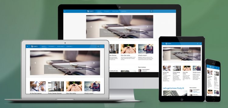
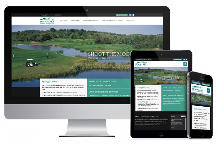
As sales of mobile devices increase (overtaking desktop sales), so does the importance of mobile-friendly responsive websites. So what is a responsive site? Simply put, a website using a responsive design means it fits all devices. Of course, Wikipedia helps to provide a more in-depth explanation:
"Responsive web design is a web design approach aimed at crafting sites to provide an optimal viewing experience—easy reading and navigation with a minimum of resizing, panning, and scrolling-across a wide range of devices."
Why is responsive design so important in 2014? Let's start with the percentages.
Did you know that a new visitor to your website will form a first impression in two-tenths of a second! In about 2.6 seconds users will focus their attention on the area that most influences their first impression. These statics come from eye-tracking studies conducted at the Missouri University of Science and Technology. And while great content helps, first impressions are 94% related to a website’s design.

How many times have you visited a website, only to dismiss it almost immediately and click elsewhere because, basically, it sucked? When it comes to your site, it's important to look at usability for your potential and existing customers. The following points will hopefully address what your site may or may not be taking into account.