Responsive Websites Make Sense, and Cents
Published in Design
As sales of mobile devices increase (overtaking desktop sales), so does the importance of mobile-friendly responsive websites. So what is a responsive site? Simply put, a website using a responsive design means it fits all devices. Of course, Wikipedia helps to provide a more in-depth explanation:
"Responsive web design is a web design approach aimed at crafting sites to provide an optimal viewing experience—easy reading and navigation with a minimum of resizing, panning, and scrolling-across a wide range of devices."
Why is responsive design so important in 2014? Let's start with the percentages.
Website DO's and DON'Ts
Published in Tips & How To
If done properly, your website can be one of the best marketing tools for your business. It's more than just a modern-day digital phone book ad (remember phone books?). Your site is an interactive online office or storefront that's open 24/7. Here are some basic DO's and DON'Ts that all websites should follow to ensure a great user experience:
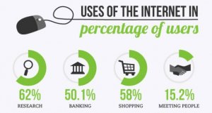
When's the last time you were thinking about a product or service only to find yourself jumping on to Google to do some research? An interesting infographic on a day in the life of the internet from May, 2013 outlined that more than 1.7 billion people world wide use the internet everyday, with 62% using it for research. If you don't have a website for your business, odds are that you're missing out!
First Impressions in .2 Seconds!
Published in Design
Did you know that a new visitor to your website will form a first impression in two-tenths of a second! In about 2.6 seconds users will focus their attention on the area that most influences their first impression. These statics come from eye-tracking studies conducted at the Missouri University of Science and Technology. And while great content helps, first impressions are 94% related to a website’s design.